When a product designer creates a digital product logo from scratch
This time, we will try to apply the design perspective of a product designer to the creation of a service logo.
Product Designer’s Design Method
Designers who create the appearance of a service can easily get caught up in the idea of creating a ‘cool-looking’ service. For actual digital products, I think designers should put aside their own preferences for a moment and think about what users need or what the market wants before making suggestions. This is because services that continue to garner responses from the market and users are more likely to survive for a long time, and based on this, more opportunities are naturally given to design user experiences.
In this context, the most helpful thing for a product designer to create a good portfolio is to create or operate an actual digital product. Most companies expect product designers to have aesthetic aspects as well, but in the end, they think about ‘what attempts and experiences they have had to solve a certain problem.’ The experience that can best reveal this aspect is actual digital product design experience.
So what process does a designer go through when creating a service? In this article, I will try to create a situation where I am designing a ‘recipe app’ as an example. This is because it is a genre that many people refer to for cooking, so it is popular, and after quick research, it appears that there is no exclusive service in the Korean app market yet.
Caution! The analysis in this article is intended to assist readers in their research and has nothing to do with the actual strategy of the service mentioned. Since this is a hypothetical situation, it may differ from actual user data and brand intent.
1. Take a look at the actual service logo
Because the logo is the simplest form of image that customers can see before using the service, it becomes the first impression that can leave an imprint on users of the recipe app you plan to design in the future. First, I think it would be helpful to infer what kind of logos have been released in the world and why they have that shape. There are many different types of logos in this world, and by analyzing each logo, we can infer the strategy and intention of each brand. Here, we will narrow it down to the logo of a digital service and its shape, analyze the reason for the shape, and apply it to the logic of the recipe app we will design.
Do you remember the numerous icons you see when using apps on your smartphone? Simply put, a logo is a representative shape that can represent the service. For app services, their logo is generally placed in the app icon area. Let’s look at the characteristics of the logo in the example image.
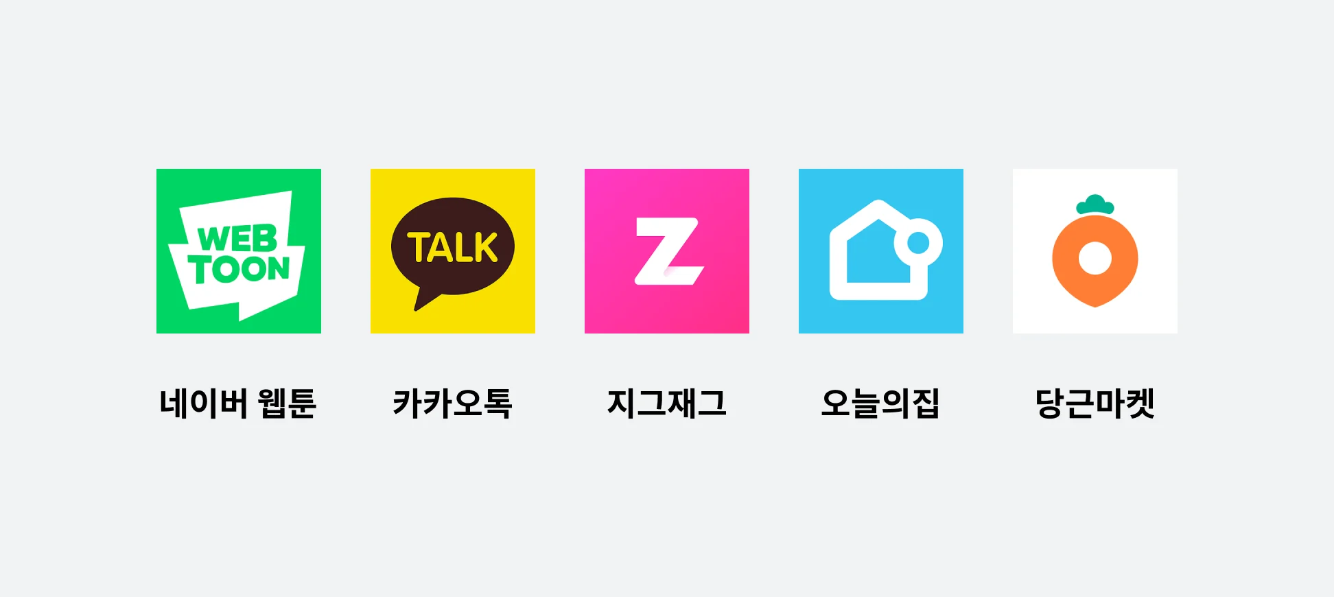
- In the case of Naver Webtoon and KakaoTalk, words that represent the service are included in the logo as the main word. The shape, which looks like a combination of cartoon cuts, and the shape of the speech bubble seem to help you quickly understand what kind of service it is.
- ZigZag's logo also uses the word, but in a slightly different form. When you zigzag like this, you can express the shape of the ‘road’ and the word ‘Zigzag’ at the same time.
- How about the Today House logo? I think the logo is a combination of the first letter of the service, ‘O’, and the shape of a ‘house’.
- In the case of Carrot Market, it is in the form of a carrot (near you) shaped GPS that uses the service name as is.
Although the expression methods are different, all five services have something in common: they are designed so that the characteristics of the service can be recognized at a glance even by looking at the logo without directly entering the service.
2. Take a look at the recipe service logo
Now that we have looked at the characteristics that make up the logo, it would be a good idea to apply them to create a logo for the ‘Recipe App’. However, as I was thinking about designing it, I started to wonder if there were any other recipe apps and, if so, what kind of logo they were using. So this time, we will analyze the logos of other recipe services already on the market. By researching logos in the same industry, you can exclude similar logo designs (copyright risk) in advance, and you can also be inspired by expression methods you hadn't thought of before.
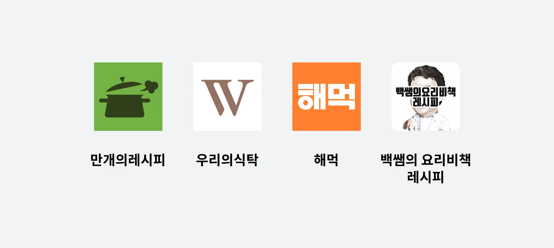
If you look at the logo of the store's top recipe app, the first impression and appearance looks very different from the service logo we looked at earlier. However, if you look closely, it appears that strategies such as using the first letter of the shape or service name were used here as well. Let's look at two interesting points.
- The colors that make up the logo are mostly colors found in the dishes we eat (green, brown, orange, etc.). What if the logo color was purple? In general, purple has the effect of reducing appetite, so if used in a recipe app, it may have a negative impact on the first impression of the product. In this way, you can design a service logo by considering the characteristics of the service you want to create and the color characteristics.
- The last ‘Teacher Baek’s Cooking Secret Book Recipes’ service logo is a new type. It seems that the strategy was to increase the reliability of the service by including both celebrity illustrations and main product names in the logo. It seems to be an effective strategy because the celebrity name ‘Baeksam’ and the recipe name ‘Cooking Secret Book’ were already imprinted on many consumers before the service. However, at the same time, because so many elements are packed into a small space, it also has the characteristic of being difficult to immediately understand the meaning of the logo compared to other logos. This strategy seems riskier in a situation where the value of the recipe app must be considered from the beginning without elements that are already imprinted on users. Due to the nature of the store logo, which can be passed by in a very short period of time, if too much information is put into the logo area, there is a high probability that the user will not pay attention to the service and the service will not be selected.
3. Create a service logo
Now that you've looked at several logos on the market, it's time to create your own service logo. Before putting your hands on logo design, you need to have an actual idea of what kind of logo you want to create. By looking at other logos, you set a standard to apply to the service you are creating.
- Image that allows you to quickly identify recipe service-related keywords (cooking or taste or recipe)
- Casual feeling, approachable image
- Appetizing images, if possible.
- Images without a lot of information
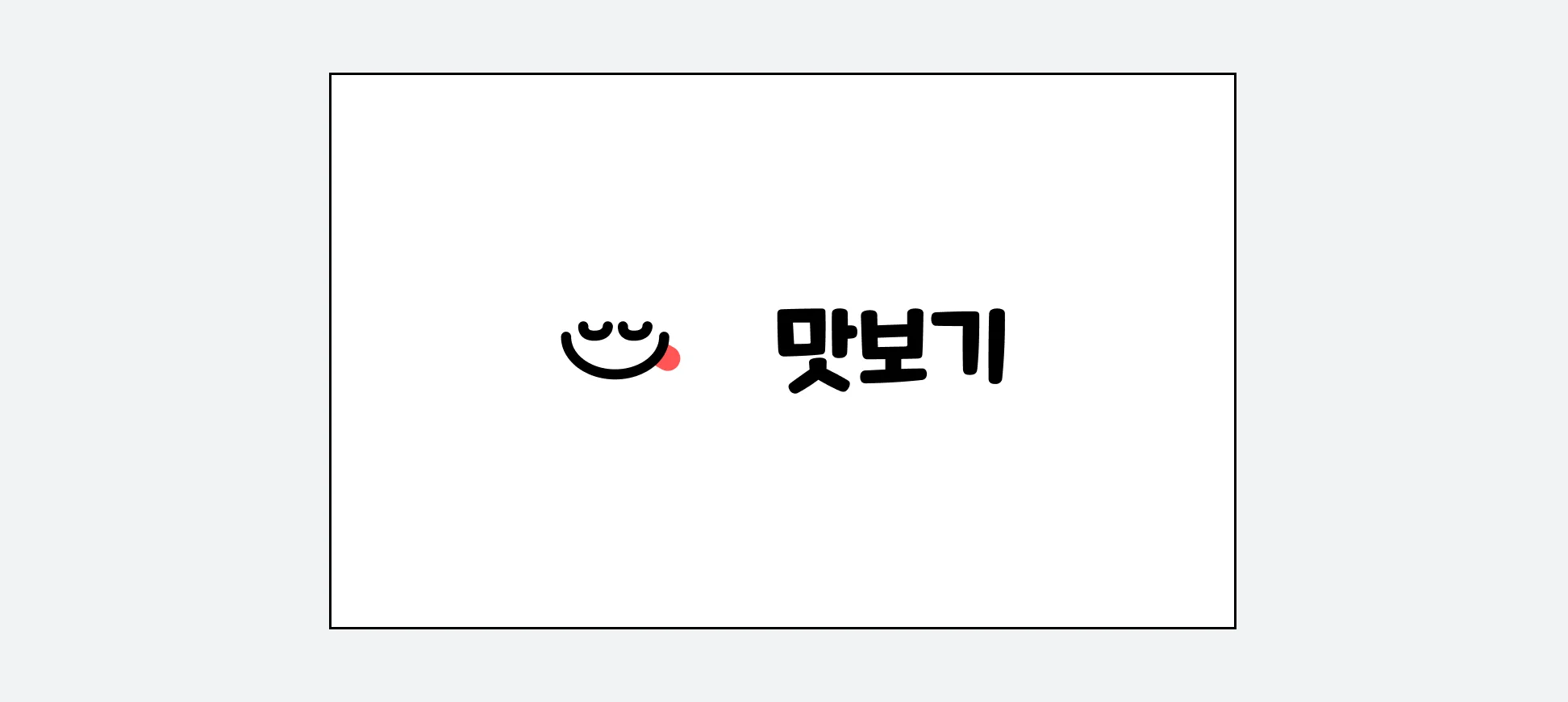
Let's first look at the image on the left of the completed logo design.
- We judged that the first thing you see, the ‘appetizing facial expression’, is a symbol that satisfies the four criteria above and is also different from the current logo in the Korean market.
- The red color of the tongue, which is the focal point, is a color often used in actual cooking ingredients and is famous as a color that stimulates the appetite, so we thought it would go well with the service.
Next, let’s look at the process of deriving the ‘taste’ on the right as the logo.
- Along with the logo image, we also considered the name of the service. Considering four criteria, we chose the name ‘Taste’, which is a casual yet appetizing service name.
- The reason why the service name was selected at once was to think about and create a logo in the form of a typo, and this was also visualized while considering the four criteria above. The specific standards are as follows.
- It matches well with the main visual that will satisfy your taste buds.
- It fits well with the standard of ‘easy to approach’,
- We searched for ‘free for commercial use’ fonts that can be used immediately without cost restrictions or approval.
- Among the free fonts, I thought about whether the characteristics of the font itself could be perceived in a different way. For example, we excluded fonts that are already widely used nationwide and are reminiscent of a specific brand, as well as readability-oriented fonts that match the ‘body’.
After comparing several fonts based on these criteria, we selected the ‘Nexon Maple Story Bold’ font that seemed to be the most suitable.
If you do not create a font yourself, you must check whether the font to be used for branding is available for commercial use in order to use it safely. Generally, if there is a font you want to use, the scope of use of that font is specified on the website being distributed. When looking for fonts, it is a good idea to look for fonts that are distributed for free for commercial use for cost-effectiveness. ‘Nunnu’, you can easily find free Korean fonts for commercial use.
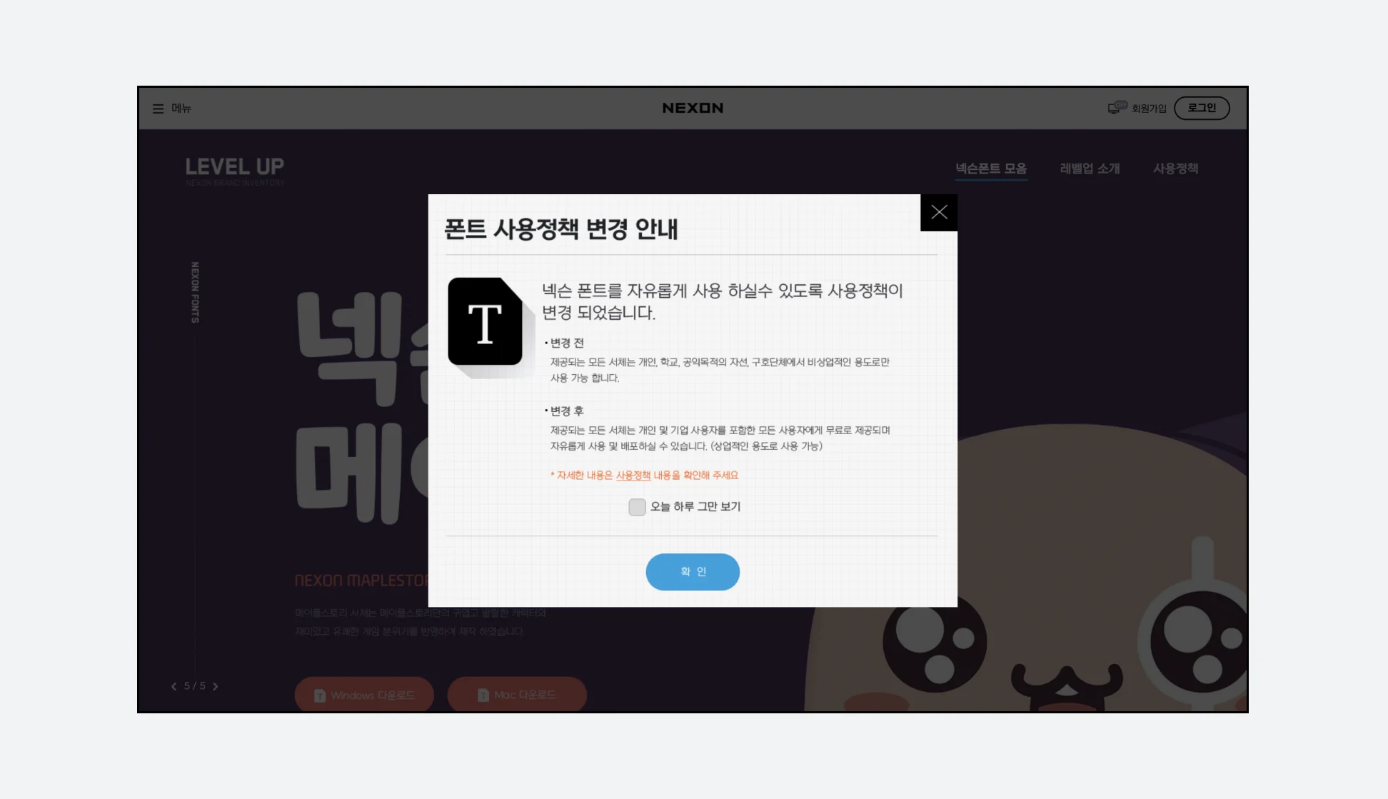
Example of font usage policy notation. It is recommended that you check whether the purpose of using the font matches the purpose specified by the font distributor before using it. Especially in the case of company work, care must be taken as indiscriminate use of fonts without considering copyright may cause great damage to the company.
Because we thought about the service name while designing the logo, we were able to think in detail about the actual form of the service and its differences from other recipe services. This is because the logo should best represent the first impression of the service. If the actual service has not yet been implemented, it is especially necessary to draw a detailed picture of the service when selecting a service name. In fact, if you have to create a service from the beginning like this, you may start with a working title and think about and finalize the service name until the specific direction of the service is determined. If you think about the service name and logo together, you can develop a variety of ways to express the service.
To summarize the method used this time, I think it could be said to be [information collection]-[pattern discovery]-[establishment of principles]-[practical application]. In real situations, it is common to receive feedback from other stakeholders midway through the process and consider it together when designing. Including the process of receiving feedback, the method used this time is similar to Double Diamond, one of the famous design methodologies. It is effective to apply a similar process when working on designs other than logos.
Q. Is this method the standard for product design?
I don’t think there is a right answer to product design. This is because a variety of factors, not just design, play a complex role in the success of a product, and this method may be better suited to a specific product, organization, or situation. product design
- Finding customers
- Find a product that will satisfy customers
- Creating and presenting
If defined as , in the extreme case, customer needs or behavior may be changing even at the moment you are reading this article. Therefore, the expected capabilities of product designers will vary depending on the company, situation, and year.
Nevertheless, I think it is meaningful to try designing according to the flow of this article. The reason is,
- It is very similar to the working process of an actual product designer,
- Learn about the role logic and analytical thinking play in product design,
- This is because similar methodologies can help you think about your own portfolio.
- The process of launching and testing products by referring to this methodology and deriving attractive insights is a competency that many companies currently consider important.
