Mobile environments as diverse as smartphone types
Since 2010, the full-fledged smartphone era has arrived, centered around Android and iPhone. Since then, many companies such as Google, Samsung, and Apple have released a variety of smartphones, and the mobile environments and features that designers need to pay attention to have become more diverse. This time, we will understand the general characteristics of the mobile environment, such as widely used resolutions and device sizes as of 2022, and find out what considerations we should make when designing.
Google, Samsung, Apple... many smartphone manufacturers are releasing new smartphones every year. But how many different smartphones are there in the world? Some phones are clear, some are wide, and some fold in half. As the device characteristics vary, the screen, color, and image quality are also different.
What is resolution?
Among these various pieces of information, resolution is a term that can express screen size and quality in a form similar to screen cells called ‘pixels’. It mainly refers to the ratio and clarity of digital output such as monitors, cell phone screens, photos, and videos. Even if the monitor is the same size, a 4K monitor is much clearer and takes up more space than other monitors. This is because the resolution of a standard 4K monitor is very high at 3840*2160.
Distinguish between resolution standards and exceptions
Designers who design digital screens should be aware of the fact that resolutions vary depending on the user's device. This is because people who access the services we design cannot use only one resolution device. In this situation, designers who have to design a screen first worry about what resolution to design at.
In conclusion, it is generally best to work at 360740 for Android and 375812 for iOS. (There may be differences depending on the situation)
Wait a minute here, 4K is a big number like 38402160, so why is the mobile resolution reduced to almost 1/10? Does the picture quality decrease that much? That's not it. As there are many different types and specifications of smartphones, the image quality that can be displayed may differ, just as the image quality of a regular monitor and a 4K monitor are different, even if the screen size is physically the same. However, that doesn't mean that some screens are 7201480, and some are 1080*2220... It is very inefficient to recognize each pixel differently and design each in this way. Therefore, in mobile OS, screen units such as pt, dp, sp, etc. appeared so that one can be well designed and applied to various situations, and the standard design resolution was unified to a multiple of 1. This is very effective because it dramatically reduces the amount of design work or unnecessary resource capacity for devices, and can display optimized images even in situations where it is difficult to output high-definition resources, such as poor Internet conditions or devices with low screen quality.
Although it will vary depending on the situation, it is also a good idea to look at the OS ratio of your potential customer's mobile device to determine mobile design resolution standards. The OS that currently divides the mobile environment is Android and iOS, and the mobile environments and standard resolutions of the two are different.
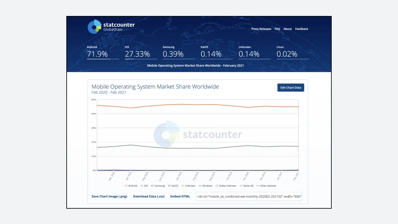
If you have internal data for reference at the start of a project, it is a good idea to utilize it. For example, if you join a company that is already operating a service, you may be able to designate as a standard the device most used by actual users of this service. If there is no data, you can search on the website. Example stat counter (https://gs.statcounter.com/)in website provides a variety of data related to the digital environment. Here, you can check general digital environment data, such as the world's OS and the proportion of devices by country.
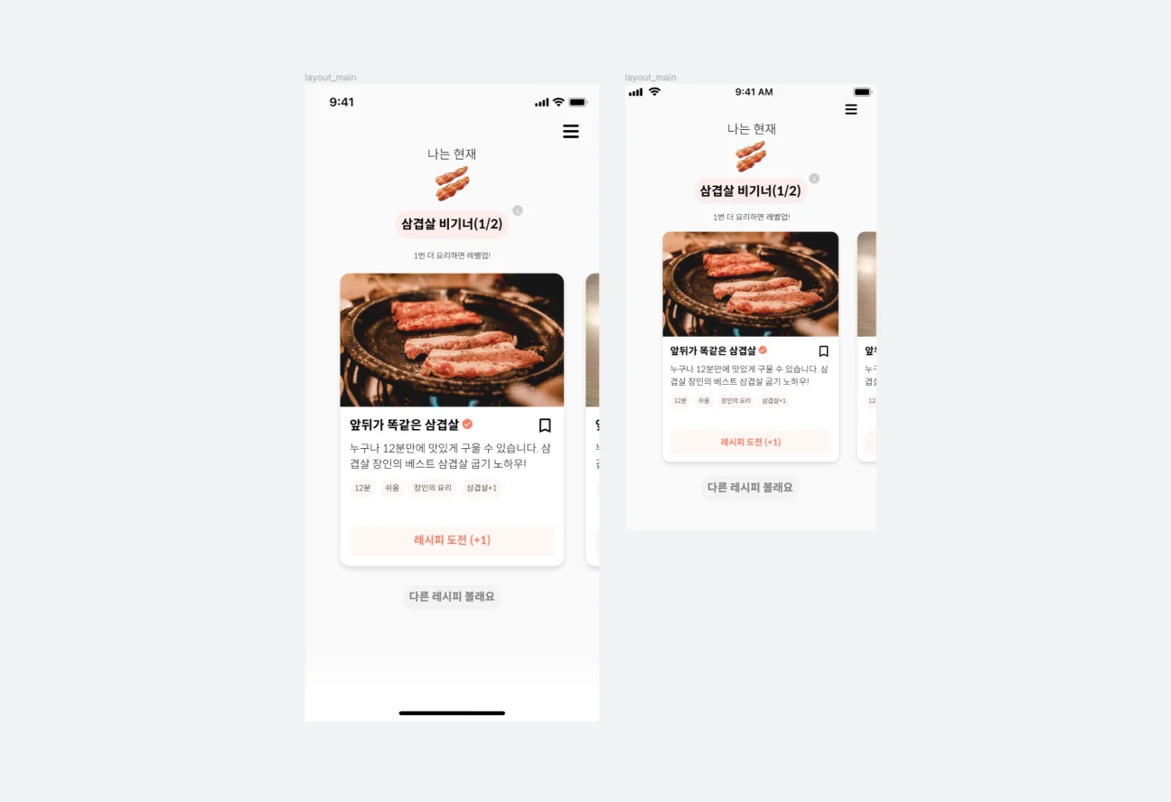
Once you've established your baseline resolution, it's time to think about exceptions. This is because, as a designer, you must strive to provide a service experience as similar as possible regardless of the user's device.
However, as the number of users increases, the types of resolutions used also increase exponentially. Should designers create design proposals to accommodate all of these devices? That's not true. This is because it is very inefficient to worry about all exceptions from the beginning. To work effectively, you need to prioritize devices used by 100,000 people over devices used by 1 or 2 people. Therefore, if you select a standard resolution and design it, it is a good idea to set rules for how UI elements will change according to various device sizes, and then develop and distribute them. Once you have set the rules, it is important to verify whether your design has actually been developed with rules that can be applied to various devices. To this end, if you can quickly share the design draft early and discuss it with the developer in charge, you can use your work time more efficiently.
As explained earlier, the mobile environment is largely divided into Android (Galaxy, Pixel, etc.) and iOS (iPhone). This is because the Samsung One UI we commonly encounter is also a modified version of the Android OS. Since the resolution and UI rules and basic interactions that must be supported for each OS are different, it is recommended to research the target of the service to be designed and the devices they use, and design based on the resolution and environment of the most common devices.
Let me give you an example. We are in a situation where we need to design a service that targets seniors in rural areas. In this case, unlike general population usage data, it can be hypothesized that the majority of users will use 360*640, the common resolution of older Android devices, and if this is verified, design can be based on that value.
Work with multiples of 1 and extract n multiples for each environment
Mobile resolutions are usually expressed as numbers such as 360640, 375812. This is the 1 multiple unit I mentioned earlier, and in general cases, this is where mobile design begins. In this case, it has the advantage of being able to respond to the resolutions of various devices. The important thing to note here is that you must distinguish between pixel units and multiples of 1. What happens if we understand the actual pixel unit and extract (export) the asset? The image quality deteriorates, as shown in a on the left in the example. Most mobile devices support densities between multiples of 2~4, which is to prevent the phenomenon of poor image quality in real environments. Therefore, we must design based on a multiple of 1, but we must understand the resolution appropriate for the main device environment on which we will work and be able to extract assets accordingly.
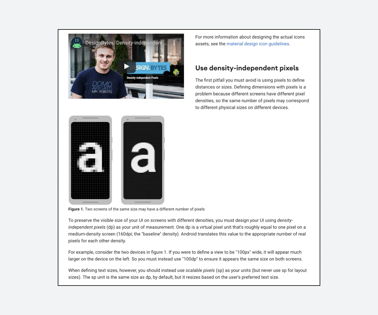
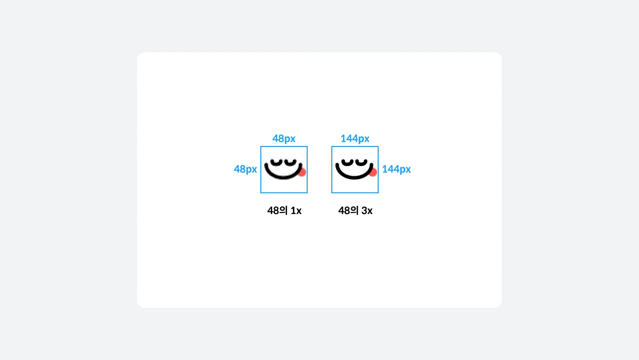
Looking at the ratio of mobile resolutions, they range from 240320px to 16002560px. But what happens if the asset size is the same for these various resolutions? In the extreme it would look like below:
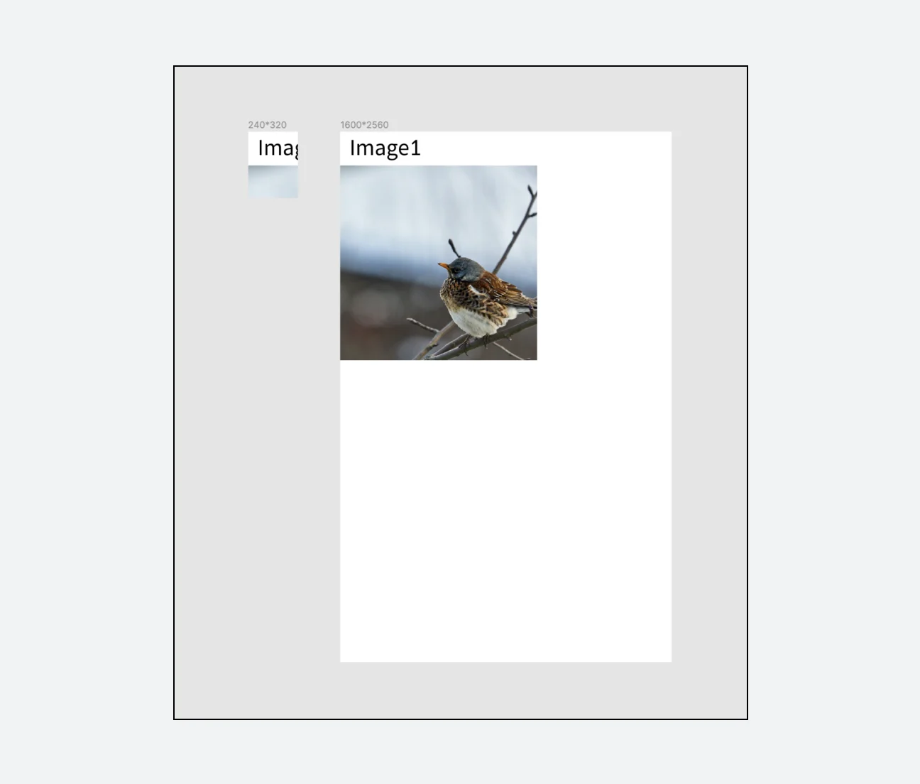
To prevent this situation in advance and show users a UI that matches the device ratio, iOS and Android use their own size notation. Even after already designing for each OS, you need to know why you need to export multiple assets according to device or OS characteristics. Let's go into more detail below.
Understanding iOS resolution
All iPhones released by Apple use iOS, and the main resolution types are relatively small, allowing for a stable UI. There are fewer buttons to click on smartphones, and instead, many interactions are gesture-based. More information about iOS design can be found in Apple's Human Interface Guidelines (HIG).
iOS uses a unit called pt. When extracting assets after design work, they are generally exported at 3x resolution. (For example, if it is a 24pt icon, iOS developers use 24, 48, 72px in multiples of 1~3)
Below are 1x resolutions for major iOS devices.
iPhone 12 - 390*844
iPhone X - 375*812
iPhone 8 - 375*667
iPhone 5 - 320*568
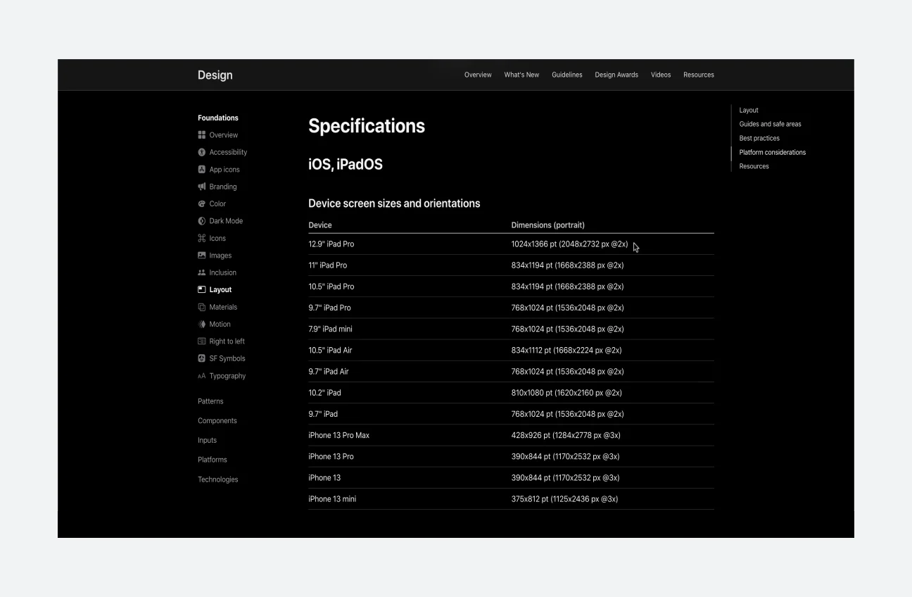
The screen above is HIG, Apple's design guideline. You can check the resolution unit for each iOS device in Foundation > Layout.
Understanding Android resolution
Android is a different situation from iOS, which is a single company product. Except for Apple, most smartphone manufacturers use Android as their OS, with Google and Samsung being the two most representative companies. There are various resolution cases as they are used by various companies, and unlike the iPhone, which operates based on finger gestures such as swiping, it is often operated by actually pressing buttons such as the bottom navigation bar.
AOS uses size units called dp and sp. Extract and use in multiples of 1~4.
Google's devices, such as the Pixel, use the Android OS they designed from scratch, while Samsung's devices, such as the Galaxy, use One UI, an AOS-based OS. There are many differences, but they have things in common, such as basically using the same store (Google Play Store) and operating based on buttons.
Below are 1x resolutions for major Android devices.
360*640
360*740
360*800
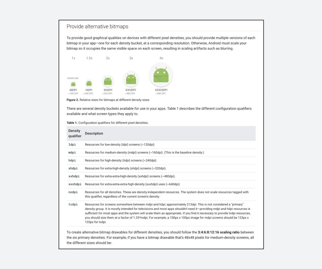
The screen above is the Android developer guide page. Like HIG, you can find a description of DPI units and resolution standards here.
Applying resolution in Figma
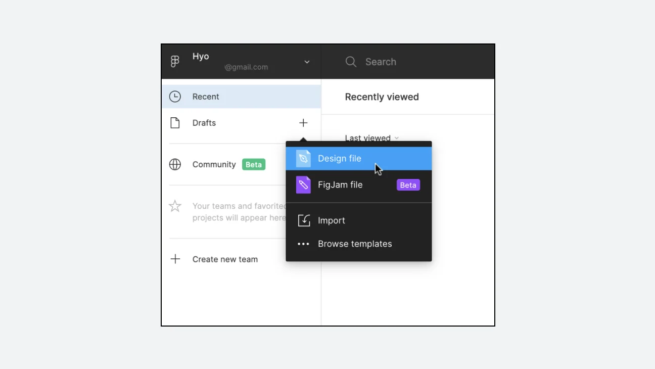
How can the design tool Figma address resolution-related concerns? First, go into Figma and create a new file.
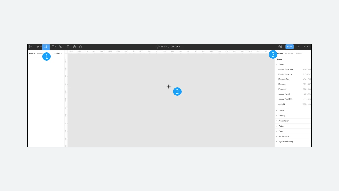
- Press [F] to activate the frame tool.
- You will see that the mouse cursor changes to a cross shape.
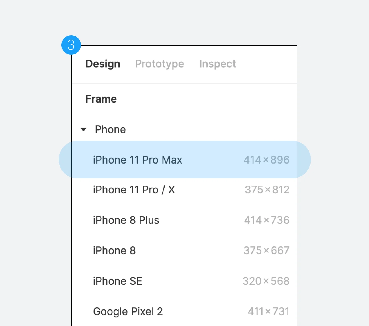
- Resolution-related presets will appear on the design panel on the right. You can check the names of various types of devices here. By dragging the mouse with the frame tool activated, you can create a frame of the desired size.